
Sigma DP2 Merrill vs. Pentax 645D Colours
I have been using the DP2 Merrill (see my previous post) interchangeably with my Pentax 645D for the last couple of weeks and must say that for many subjects, I don’t need to take out the big gun (the 645D). In terms of resolution and colour reproduction the Merrill is more than sufficient.
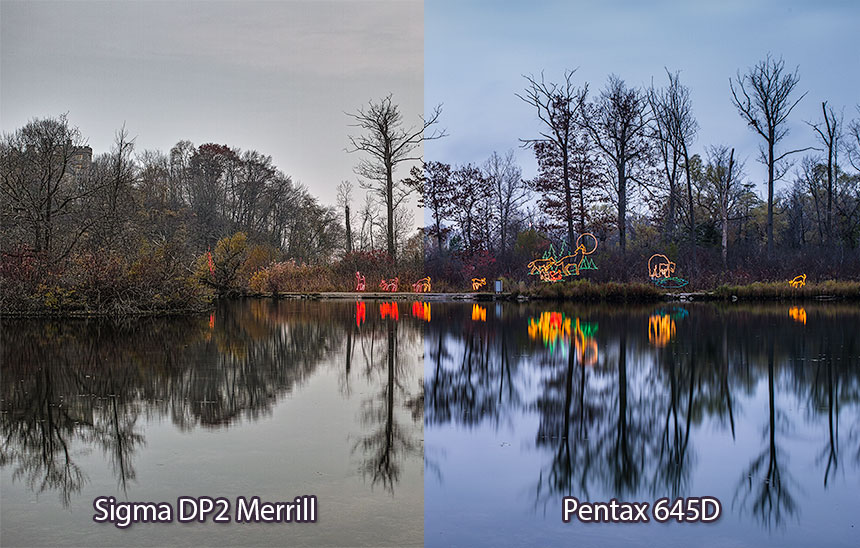
On a few subjects however, I have been surprised by the drastic difference in scene rendering between the two sensor technologies. The differences are big enough to essentially be unmatchable by typical raw file adjustments. There is no clear winner because each camera seems to do one aspect better than the other. Below is a sample scenario I encountered this weekend at the only place one can find neon lit animals in nature, the capital of tacky, niagara falls:

Standard white balance when file comes into SigmaPhotoPro + Contrast adjustments.

Standard white balance when dng comes into Lightroom.

White balance adjusted, greens in bushes still dominate and neon animals stay orange coloured (they were red).

Further adjustments to camera profile, some colours start to resemble the Merrill, animals start to turn red, the overall differences are still big.
The following are some 1:1 crops. The 645D wins on actual details resolved, this is especially noticeable around thin branches. Red leafs seem to render more pronounced on the 645D against the grey bushes while some other colours seem to have more separation on the Merrill.
I realize this is a very unscientific, odd ball comparison, but I figured I’d share some of my observations.


